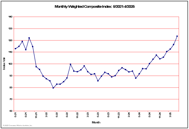
Last 10 Monthly Index Values
| Date: | 12/2024 | 01/2025 | 02/2025 | 03/2025 | 04/2025 | 05/2025 | 06/2025 | 07/2025 | 08/2025 | 09/2025 |
| Value: | 105.67 | 110.42 | 112.58 | 116.31 | 123.38 | 119.52 | 121.29 | 121.13 | 126.36 | 133.32 |
Consumer Metrics InstituteSMHistoric Charts and Commentary |
| Home | History | Automotive | Entertainment | Financial | Health | Household | Housing | Recreation | Retail | Technology | Travel | FAQs | Downloads | About |
| Date: | 12/2024 | 01/2025 | 02/2025 | 03/2025 | 04/2025 | 05/2025 | 06/2025 | 07/2025 | 08/2025 | 09/2025 |
| Value: | 105.67 | 110.42 | 112.58 | 116.31 | 123.38 | 119.52 | 121.29 | 121.13 | 126.36 | 133.32 |
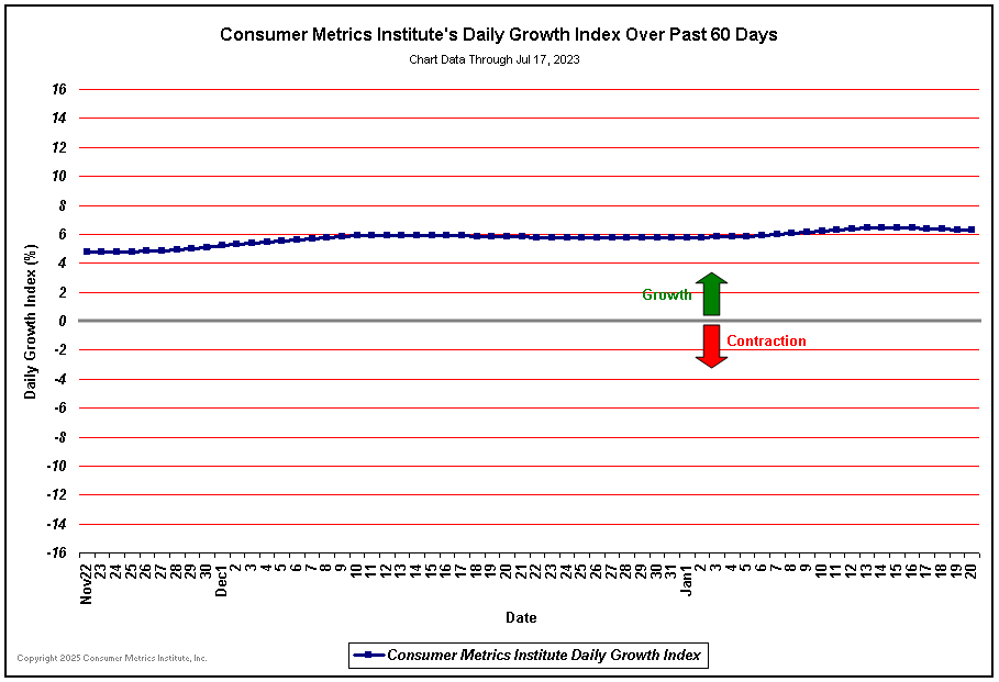
| Daily Growth Index Past 60 Days(1): | ||
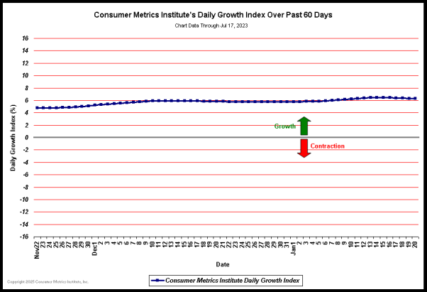 (Click here for best resolution) | ||
| Notes: (1) The daily values for the Consumer Metrics Institute's 91-day 'Trailing Quarter' Growth Index over the past 60 days. Please see our Frequently Asked Questions page for a more complete description of our Growth Index. |
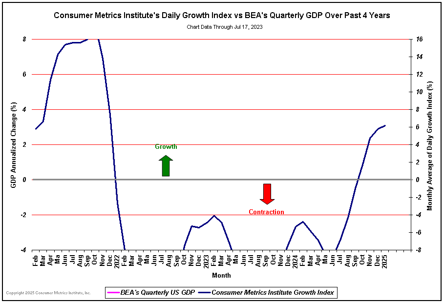
| Growth Index -vs- Full GDP, Past 4 Years(2): | ||
 (Click here for best resolution) | ||
| Notes: (2) The Consumer Metrics Institute's 91-day 'Trailing Quarter' Growth Index -vs- BEA's Quarterly Full GDP Growth Rates over past 4 years. The quarterly GDP growth rates are shown as 3-month plateaus in the graph. The Consumer Metrics Institute's Growth Index is plotted as a monthly average. |
| BEA "Real" GDP -vs- BPP Deflated "Nominal" GDP, Past 4 Years(3,4): | ||
 (Click here for best resolution) | ||
| Notes: (3) In the blue line above the BEA's nominal GDP has been deflated using the inflation rate measured by the Billion Prices Project (BPP) index. (4) Note that when deflating the line items in the GDP tables from the BEA it is important to treat the "nominal" import and export data as the effective net "real" data -- since there are no offsetting domestic transactions carrying the correspondingly inflated or deflated prices (i.e., the one-sided net impact of inflating imported commodities is "real" to the economy). The net consequences of inflating import prices may become material in times of substantial and sustained trade imbalances. |
| BEA "Real" GDP -vs- BLS Deflated Per-Capita GDP, Past 4 Years(5): | ||
 (Click here for best resolution) | ||
| Notes: (5) Line items in the BEA's nominal GDP are deflated by either the Bureau of Labor Statistic's (BLS) CPI-U index or the BLS PPI index, and reported on a per-capita basis by using Census Bureau projected mid-quarter population data. |
| BEA "Real" GDP -vs- BLS Deflated Per-Capita Disposable Income, Past 4 Years(6): | ||
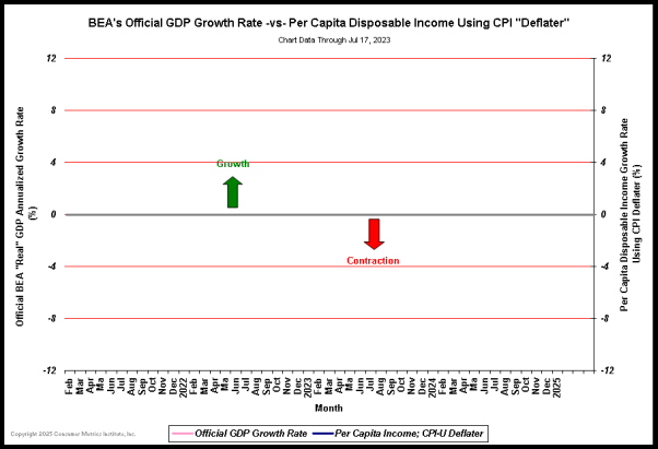 (Click here for best resolution) | ||
| Notes: (6) Line items in the BEA's Disposable Personal Income report are deflated by the Bureau of Labor Statistic's (BLS) CPI-U index and reported on a per-capita basis by using Census Bureau projected mid-quarter population data. |
| BEA "Real" GDP -vs- BLS Deflated Per-Capita Proprietor Income, Past 4 Years(7): | ||
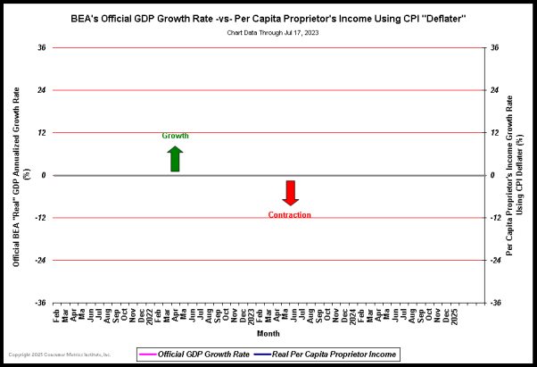 (Click here for best resolution) | ||
| Notes: (7) The Proprietors' income (with inventory valuation and capital consumption adjustments) line from the BEA's Disposable Personal Income report are deflated by the Bureau of Labor Statistic's (BLS) CPI-U index and reported on a per-capita basis by using Census Bureau projected mid-quarter population data. |
| | October 26, 2023 - BEA Reports that Third Quarter 2023 GDP Grew at a 4.89% Rate: In their first (preliminary) estimate of the US GDP for the third quarter of 2023, the Bureau of Economic Analysis (BEA) reported that the US economy was growing at a +4.89% annual rate, up 2.83 percentage points (pp) from the prior quarter. Although the economy appears to be growing at a healthy rate, the headline number is seriously and optimistically misleading -- that number is halved when the impact of inventory building and the BEA's under estimation of inflation are properly considered. Additionally, the growth in consumer spending is not fueled by increasing household disposable income; it is instead largely funded from decreased savings rates. In an earlier release, annualized household disposable income was reported to be $196 lower than in the prior quarter, and the household savings rate was reported to be 3.8%, down 0.6pp from the prior quarter. For this estimate the BEA assumed an effective annualized deflator of 3.48%. During the same quarter the inflation recorded by the Bureau of Labor Statistics (BLS) in their CPI-U index was higher at 4.88%. Under estimating inflation results in optimistic growth rates, and if the BEA's nominal data was deflated using CPI-U inflation information the headline growth number would have been 3.67%. Among the notable items in the report : -- Consumer spending for goods was reported to be growing at a 1.08% rate, up 0.97pp from the prior quarter. -- The contribution to the headline from consumer spending on services was reported to be 1.62%, up 1.18pp from the prior quarter. The combined consumer contribution to the headline number was 2.70%, up 2.15pp from the prior quarter. -- The headline contribution for commercial/private fixed investments was reported to be 0.15%, down 0.75pp from the prior quarter. -- Inventories added 1.32% to the headline number. It is important to remember that the BEA's inventory numbers are exceptionally noisy (and susceptible to significant distortions/anomalies caused by commodity pricing or currency swings) while ultimately representing a zero reverting (and long term essentially zero sum) series. -- The contribution to the headline from governmental spending was reported to be 0.79%, up 0.22pp from the prior quarter. -- The contribution from exports was reported to be 0.68%, up 1.77pp from the prior quarter. -- Imports subtracted 0.75% annualized 'growth' from the headline number, down 1.88pp from the prior quarter. Foreign trade contributed a net -0.07pp to the headline number. -- The annualized growth in the 'real final sales of domestic product' was reported to be 3.57%, up 1.51pp from the prior quarter. This is the BEA's 'bottom line' measurement of the economy (and it excludes the inventory data). -- As mentioned above, real per-capita annualized disposable income was reported to have decreased by $196 quarter to quarter. The annualized household savings rate was 3.8% (down 0.6pp from the prior quarter). In the 61 quarters since 2Q-2008 the cumulative annualized growth rate for real per-capita disposable income has been 1.35%. The Numbers As a quick reminder, the classic definition of the GDP can be summarized with the following equation : or, as it is commonly expressed in algebraic shorthand : In the new report the values for that equation (total dollars, percentage of the total GDP, and contribution to the final percentage growth number) are as follows : GDP Components Table
Quarterly Changes in % Contributions to GDP
Summary and Commentary The key points of this report can be summarized as follows: -- After factoring in the growth of inventories and the BEA's under estimation of inflation, these numbers actually look very similar to those of the prior quarter. -- As a consequence, setting the optimistic headline aside, the economy is probably growing at a relatively healthy +2.5% rate. That is a lily that needs not be gilded. -- All that said, households are probably not as healthy as consumer spending levels might indicate. -- In late September the BEA did a comprehensive revision of its historical data back through 2017, and shifted its constant-dollar reference year from 2012 to 2017. The net impact of the revisions was an average change in annualized headline growth rates of +0.0843 percentage points. Most of that upside revision resulted from persistent under reporting of commercial/private fixed investments. Please note that this will be our final report analyzing BEA GDP releases. It is time to ride off into the sunset. We want to thank our regular readers for their support over the past 15+ years, and we wish them (and the US economy) the very best in the future. | |||||||||||||||||||||||||||||||||||||||||||||||||||||||||||||||||||||||||||||||||||||||||||||||||||||||||||||||||||||||||||||||||||||||||||||||||||||||||||||||||||||||||||
| | July 27, 2023 - BEA Reports that Second Quarter 2023 GDP Grew at a 2.41% Rate: In their first (preliminary) estimate of the US GDP for the second quarter of 2023, the Bureau of Economic Analysis (BEA) reported that the US economy was growing at a +2.41% annual rate, up 0.42 percentage points (pp) from the prior quarter. Although the growth rates for consumer spending on both goods and services cooled significantly, the headline number stayed above 2% due to materially improved growth rates in inventories and fixed investments. Exports contracted during the quarter, while imports grew enough to neutralize the impact of foreign trade on the headline. In an earlier release, annualized household disposable income was reported to be $231 higher than in the prior quarter, and the household savings rate was reported to be 4.4%, down 0.4pp from the prior quarter. For this estimate the BEA assumed an effective annualized deflator of 2.22%. During the same quarter the inflation recorded by the Bureau of Labor Statistics (BLS) in their CPI-U index was slightly higher at 2.72%. Under estimating inflation results in optimistic growth rates, and if the BEA's nominal data was deflated using CPI-U inflation information the headline growth number would have been 1.96%. Among the notable items in the report : -- Consumer spending for goods was reported to be growing at a 0.16% rate, down 1.18pp from the prior quarter. -- The contribution to the headline from consumer spending on services was reported to be 0.95%, down 0.49pp from the prior quarter. The combined consumer contribution to the headline number was 1.11%, down 1.67pp from the prior quarter. -- The headline contribution for commercial/private fixed investments was reported to be 0.83%, up 0.91pp from the prior quarter. -- Inventories added 0.14% to the headline number, up 2.28pp from the prior quarter. It is important to remember that the BEA's inventory numbers are exceptionally noisy (and susceptible to significant distortions/anomalies caused by commodity pricing or currency swings) while ultimately representing a zero reverting (and long term essentially zero sum) series. -- The contribution to the headline from governmental spending was reported to be 0.45%, down 0.40pp from the prior quarter. -- The contribution from exports was reported to be -1.28%, down 2.14pp from the prior quarter. -- Imports added 1.16% annualized 'growth' to the headline number, up 1.44pp from the prior quarter. Foreign trade contributed a net -0.12pp to the headline number. -- The annualized growth in the 'real final sales of domestic product' was reported to be 2.27%, down 1.86pp from the prior quarter. This is the BEA's 'bottom line' measurement of the economy (and it excludes the inventory data). -- As mentioned above, real per-capita annualized disposable income was reported to have increased by $231 quarter to quarter. The annualized household savings rate was 4.4% (down 0.4pp from the prior quarter). In the 60 quarters since 2Q-2008 the cumulative annualized growth rate for real per-capita disposable income has been 1.26%. The Numbers As a quick reminder, the classic definition of the GDP can be summarized with the following equation : or, as it is commonly expressed in algebraic shorthand : In the new report the values for that equation (total dollars, percentage of the total GDP, and contribution to the final percentage growth number) are as follows : GDP Components Table
Quarterly Changes in % Contributions to GDP
Summary and Commentary The key points of this report can be summarized as follows: -- The consumer spending growth rate softened significantly, contributing only 1.11% to the headline number. This was down 1.67pp from the prior quarter. -- The lower growth rate in consumer spending was consistent with the continued erosion of the household savings rate, indicating that households are finding their budgets tighter than they might like. Although inflation has moderated, household incomes still have some catching up to do. -- The BEA's own "bottom line" (real final sales) essentially halved from the prior quarter. At face value this was a good report, since once again the headline number falls into the "Goldilocks" zone. | |||||||||||||||||||||||||||||||||||||||||||||||||||||||||||||||||||||||||||||||||||||||||||||||||||||||||||||||||||||||||||||||||||||||||||||||||||||||||||||||||||||||||||
| | April 27, 2023 - BEA Reports that First Quarter 2023 GDP Grew at a 1.07% Rate: In their first (preliminary) estimate of the US GDP for the first quarter of 2023, the Bureau of Economic Analysis (BEA) reported that the US economy was growing at a +1.07% annual rate, down 1.50 percentage points (pp) from the prior quarter. The headline growth rate of +1.07% is materially lower than the BEA's preferred 'bottom line' growth number (the 'real final sales of domestic product'), which excludes inventory adjustments and was reported to be +3.33%. In fact, the growth in consumer spending on both goods and services increased quarter-over-quarter, and the combined consumer contribution to the headline number was a respectable 2.48%, up 1.77pp from the prior quarter. For this estimate the BEA assumed an effective annualized deflator of 4.00%. During the same quarter the inflation recorded by the Bureau of Labor Statistics (BLS) in their CPI-U index was lower at 3.82%. Over estimating inflation results in pessimistic growth rates, and if the BEA's nominal data was deflated using CPI-U inflation information the headline growth number would have been 1.29%. Among the notable items in the report : -- Consumer spending for goods was reported to be growing at a 1.45% rate, up 1.46pp from the prior quarter. -- The contribution to the headline from consumer spending on services was reported to be 1.03%, up 0.31pp from the prior quarter. -- The headline contribution for commercial/private fixed investments was reported to be essentially neutral at -0.07%, up 0.61pp from the prior quarter. This ended three quarters of more significant contraction. -- Inventories subtracted 2.26% from the headline number, down 3.73pp from the prior quarter. It is important to remember that the BEA's inventory numbers are exceptionally noisy (and susceptible to significant distortions/anomalies caused by commodity pricing or currency swings) while ultimately representing a zero reverting (and long term essentially zero sum) series. -- The contribution to the headline from governmental spending was reported to be 0.81%, up 0.16pp from the prior quarter. -- The contribution from exports was reported to be 0.54%, up 0.98pp from the prior quarter. -- Imports subtracted 0.43% annualized 'growth' from the headline number, down 1.29pp from the prior quarter. Foreign trade contributed a net 0.11pp to the headline number. -- As mentioned above, the annualized growth in the 'real final sales of domestic product' was reported to be 3.33%, up 2.23pp from the prior quarter. This is the BEA's 'bottom line' measurement of the economy (and it excludes the inventory data). -- In an earlier release, real per-capita annualized household disposable income was reported to have increased by $840 quarter to quarter. The annualized household savings rate was 4.8% (up 1.9pp from the prior quarter). In the 59 quarters since 2Q-2008 the cumulative annualized growth rate for real per-capita disposable income has been 1.28%. The Numbers As a quick reminder, the classic definition of the GDP can be summarized with the following equation : or, as it is commonly expressed in algebraic shorthand : In the new report the values for that equation (total dollars, percentage of the total GDP, and contribution to the final percentage growth number) are as follows : GDP Components Table
Quarterly Changes in % Contributions to GDP
Summary and Commentary The key points of this report can be summarized as follows: -- This report is not nearly as bad as the headline number might indicate, having suffered materially from inventory draw downs. -- Consumer spending on both goods and services improved to a respectable growth rate. -- Three quarters of contraction in spending for commercial/private fixed investment essentially stopped, and governmental spending remained robust. -- Perhaps most significantly, household disposable income saw enough of an increase that savings rates took a noticeable upturn. Except for the modest headline number, this was not the "start of a downturn" report that many had expected. In fact, consumer spending on goods showed surprising strength after suffering through four consecutive quarters of contraction. That noted, we will eagerly await the next round of BEA annual adjustments three months hence. | |||||||||||||||||||||||||||||||||||||||||||||||||||||||||||||||||||||||||||||||||||||||||||||||||||||||||||||||||||||||||||||||||||||||||||||||||||||||||||||||||||||||||||
| | January 26, 2023 - BEA Reports that Fourth Quarter 2022 GDP Grew at a 2.88% Rate: In their first (preliminary) estimate of the US GDP for the fourth quarter of 2022, the Bureau of Economic Analysis (BEA) reported that the US economy was growing at a +2.88% annual rate, down 0.37 percentage points (pp) from the prior quarter. The fourth quarter was one of relatively weak growth in consumer spending (with an aggregate goods and services growth rate of 1.42%, down 0.13pp from the prior quarter) and growing inventories (contributing 1.46%, over half of the headline growth). This meant that the BEA's 'bottom line' growth rate (the 'real final sales of domestic product', which excludes the inventory data) was roughly half of the headline number at 1.42%. Critically, the contraction of spending for commercial/private fixed investment accelerated, subtracting 1.20% from the headline number. In an earlier release, annualized household disposable income was reported to be $299 higher than in the prior quarter, and the household savings rate was reported to be 2.9%, up 0.2pp from the prior quarter. For this estimate the BEA assumed an effective annualized deflator of 3.53%. During the same quarter the inflation recorded by the Bureau of Labor Statistics (BLS) in their CPI-U index was lower at 1.83%. Over estimating inflation results in pessimistic growth rates, and if the BEA's nominal data was deflated using CPI-U inflation information the headline growth number would have been 4.67%. Among the notable items in the report : -- Consumer spending for goods was reported to be growing at a 0.26% rate, up 0.34pp from the prior quarter. -- The contribution to the headline from consumer spending on services was reported to be 1.16%, down 0.47pp from the prior quarter. The combined consumer contribution to the headline number was 1.42%, down 0.13pp from the prior quarter. -- The headline contribution for commercial/private fixed investments was reported to be -1.20%, down 0.58pp from the prior quarter. -- Inventories added 1.46% to the headline number, up 2.65pp from the prior quarter. It is important to remember that the BEA's inventory numbers are exceptionally noisy (and susceptible to significant distortions/anomalies caused by commodity pricing or currency swings) while ultimately representing a zero reverting (and long term essentially zero sum) series. -- The contribution to the headline from governmental spending was reported to be 0.64%, down 0.01pp from the prior quarter. -- The contribution from exports was reported to be -0.15%, down 1.80pp from the prior quarter. -- Imports added 0.71% annualized 'growth' to the headline number, down 0.50pp from the prior quarter. Foreign trade contributed a net 0.56pp to the headline number. -- The annualized growth in the 'real final sales of domestic product' was reported to be 1.42%, down 3.02pp from the prior quarter. This is the BEA's 'bottom line' measurement of the economy (and it excludes the inventory data). -- As mentioned above, real per-capita annualized disposable income was reported to have increased by $299 quarter to quarter. The annualized household savings rate was 2.9% (up 0.2pp from the prior quarter). In the 58 quarters since 2Q-2008 the cumulative annualized growth rate for real per-capita disposable income has been 1.11%. The Numbers As a quick reminder, the classic definition of the GDP can be summarized with the following equation : or, as it is commonly expressed in algebraic shorthand : In the new report the values for that equation (total dollars, percentage of the total GDP, and contribution to the final percentage growth number) are as follows : GDP Components Table
Quarterly Changes in % Contributions to GDP
Summary and Commentary The key points of this report can be summarized as follows: -- The headline number seems to be close enough to 3% to be respectable. This masks relatively weak growth in consumer spending and materially contracting fixed investments. -- The contraction in fixed investments can be found in IT spending and residential construction, two sectors that we might expect to be driving a healthy economy. -- Household disposable income did tick upward, although savings rates remain near record lows. Households remain cautious in their spending, as the lackluster consumer goods and services growth rates and growing inventories confirm. -- Federal agencies continue to have problems agreeing on their measures of inflation. The spread between the BEA and BLS metrics is material, and it makes policy decisions even more difficult. This is yet another case where the headline number is better than the underlying details might warrant. This report simply does not show an economy that is ready for explosive growth. Please note that moving forward we will be providing our GDP reporting analysis only once each quarter, upon the release of the BEA's initial (preliminary) report for each quarter (i.e., in January, April, July and October). | |||||||||||||||||||||||||||||||||||||||||||||||||||||||||||||||||||||||||||||||||||||||||||||||||||||||||||||||||||||||||||||||||||||||||||||||||||||||||||||||||||||||||||
| | December 22, 2022 - BEA Revises Third Quarter 2022 GDP Growth Upward to 3.25%: In their third and final estimate of the US GDP for the third quarter of 2022, the Bureau of Economic Analysis (BEA) reported that the US economy was growing at a +3.25% annual rate, up 0.32 percentage points (pp) from their previous estimate and up 3.83pp from the prior quarter. The upward revision to the headline number came from several sources: consumer spending on services increased 0.41pp, commercial/private fixed investments added 0.12pp, and governmental spending increased another 0.12pp. Larger inventory draw-downs subtracted 0.22pp more than in the previous report, while other line item revisions were not material. In an earlier release, annualized household disposable income was revised $10 higher than in the previous report, and the household savings rate was reported to be 2.7%, down 0.1pp from the previous report. Federal agencies have had problems agreeing on their measures of inflation for the quarter. For this estimate the BEA assumed an effective annualized deflator of 4.36%. During the same quarter the inflation recorded by the Bureau of Labor Statistics (BLS) in their CPI-U index was significantly lower at 1.96%. Over estimating inflation results in pessimistic growth rates, and if the BEA's nominal data was deflated using CPI-U inflation information the headline growth number would have been 5.80%. Among the notable items in the report : -- Consumer spending for goods was reported to be contracting at a -0.08% rate, down -0.04pp from the previous estimate and up 0.53pp from the prior quarter. -- The contribution to the headline from consumer spending on services was reported to be 1.63%, up 0.41pp from the previous report and down -0.36pp from the prior quarter. The combined consumer contribution to the headline number was 1.55%, up 0.37pp from the previous report. -- The headline contribution for commercial/private fixed investments was revised to -0.62%, up 0.12pp from the previous report and up 0.30pp from the prior quarter. -- Inventories subtracted -1.19% from the headline number, down 0.22pp from the previous report and up 0.72pp from the prior quarter. It is important to remember that the BEA's inventory numbers are exceptionally noisy (and susceptible to significant distortions/anomalies caused by commodity pricing or currency swings) while ultimately representing a zero reverting (and long term essentially zero sum) series. -- The contribution to the headline from governmental spending was revised to 0.65%, up 0.12pp from the previous report and up 0.94pp from the prior quarter. -- The contribution from exports was revised to 1.65%, down 0.07pp from the previous report and up 0.14pp from the prior quarter. -- Imports added 1.21% annualized 'growth' to the headline number, unchanged from the previous report and up 1.56pp from the prior quarter. Foreign trade contributed a net 2.86pp to the headline number. -- The annualized growth in the 'real final sales of domestic product' was revised to 4.44%, up 0.54pp from the previous report and up 3.11pp from the prior quarter. This is the BEA's 'bottom line' measurement of the economy (and it excludes the inventory data). -- As mentioned above, real per-capita annualized disposable income was revised $10 higher than in the previous estimate. The annualized household savings rate was 2.7% (down 0.1pp from the previous report). In the 57 quarters since 2Q-2008 the cumulative annualized growth rate for real per-capita disposable income has been 1.09%. The Numbers, As Revised As a quick reminder, the classic definition of the GDP can be summarized with the following equation : or, as it is commonly expressed in algebraic shorthand : In the new report the values for that equation (total dollars, percentage of the total GDP, and contribution to the final percentage growth number) are as follows : GDP Components Table
Quarterly Changes in % Contributions to GDP
Summary and Commentary The key points of this report can be summarized as follows: -- As a stand-alone quarter, Q3-2022 seems to be showing comfortable growth. Normally, we should be very pleased. -- That said, wildly different measurements of quarterly inflation make any estimates of "real" growth extremely difficult. In short, the optimism that can be drawn from this report should be, at best, somewhat guarded. Please note that starting in January 2023 we will be providing our GDP reporting analysis only once each quarter, upon the release of the BEA's initial (preliminary) report for each quarter (i.e., in January, April, July and October). | |||||||||||||||||||||||||||||||||||||||||||||||||||||||||||||||||||||||||||||||||||||||||||||||||||||||||||||||||||||||||||||||||||||||||||||||||||||||||||||||||||||||||||