 | Consumer Metrics Institute News Feed Subscribe to Consumer Metrics Institute News by Email |
Consumer Metrics Institute
Home of Daily Consumer Leading Indicators
| Consumer Metrics InstituteHome of Daily Consumer Leading Indicators |
| Home | History | Automotive | Entertainment | Financial | Health | Household | Housing | Recreation | Retail | Technology | Travel | FAQs | Downloads | Membership | Contact | About |
| February 7, 2011 - Measuring the Impact of "Strategic Defaults" and Mortgage Delinquencies on Consumer Spending: At our speaking engagements we are always asked a question that we have finally decided needed a good answer: How much is consumer spending benefiting from "strategic defaults" and mortgage delinquencies? To quantify an answer to that question we have to understand both the scope of the defaults/delinquencies involved and the likely behavior of the consumers caught up in those situations. Scope of Defaults and Delinquencies The best data that we have seen to-date on the scope of delinquency issues is published quarterly by the Mortgage Bankers Association ("MBA"). Their latest report was published on November 18, 2010 and covers the third quarter of 2010. In that data release the overall (non-seasonally adjusted) delinquency rate for owner occupied one-to-four-unit residential properties was reported to be 9.39%. According to their press release that specific "delinquency rate includes loans that are at least one payment past due but does not include loans in the process of foreclosure." The MBA report then separately addresses the additional percentage of loans that had progressed to "the foreclosure process," reporting that the number was 4.39%. This would bring the total number of non-mortgage-paying owner-occupiers (delinquencies through foreclosures) to about 13.8%. Economic Impact of Defaults and Delinquencies To estimate the economic impact of the defaulting homeowners, we can do some back-of-the-envelope calculations using data from the U.S. Census Bureau. In their latest publication of the "American Housing Survey" (covering the fall of 2009), there were about 76.4 million owner-occupied housing units, of which 50.3 million had at least one mortgage still active. If the 13.8% total delinquency rate is applied to the number of currently active mortgages, roughly 6.9 million homeowners have missed at least one mortgage payment. Since some of these instances might not be in irretrievable default (or involve multiple mortgages on the same property), we chose to use a more conservative 5 million for the purposes of our calculations. From another Census Bureau table we can make educated estimates of the total cash-flow represented by the 5 million delinquencies. From the table showing the distribution of mortgages by payment value, we have extrapolated the likely average monthly principal, interest and escrow (taxes and insurance) ("PITI") payments for the delinquent mortgages. To do this we have made a two key assumptions: 1) that the owner/occupants have continued to pay utilities during their "rent free" stage; and 2) that the greater portion of defaulters had originated their loans in the past decade (and therefore had the highest payment schedules and the greatest likelihood of being upside-down). Using these assumptions, we have concluded that the the average cash-flow freed up by defaulters is about $1,500 per month. Assuming 5 million defaulters missing $1,500 per month in mortgage PITI payments, the total annualized free cash-flow is something like $90 billion -- about 8% of total annual consumer spending on discretionary durable goods. Should you feel more comfortable using average monthly payments that are higher or lower than the $1,500 that we used, simply scale the $90 billion accordingly. Behavioral Patterns Clearly not all of the $90 billion will end up as consumer spending. Presumably many defaulters have maxed-out their credit cards before starting the default process -- although there is some evidence that at least some have treated credit cards as the more senior (or at least less hopeless) obligation. If the average household credit card debt is in the $16,000 range, for our back-of-the-envelope calculation we might assume that those in default average about twice that total -- which with the recently increased minimum payment levels will eat up about half of the freed-up cash-flow. We also understand that the defaulters will go through several stages (psychological as well as legal and financial) during the entire process. At first they may be in denial and think that they will be able to clear things up in a month or two. During that time we expect no changes in spending behavior, with any free cash ending up in a cookie jar with the intent of eventually correcting the arrears. After several months, the hopelessness of the situation may become more evident, and with that resignation there may be a real sense of liberation. Between then and the point of imminent eviction we might expect the free-cash to start to come out of the cookie jar as a self-medicated analgesic for their financial ills. If the foreclosure process gets extended through legal maneuvers, court mandated moratoriums or new claim documentation standards, the defaulters may sense a true unexpected windfall -- hitting the "free rent" lottery and loosening their spending constraints. Some law practices have moved into this niche, indicating that aggressive defense tactics can extend the foreclosure process to as much as 18 months. Any such delays will simply swell the number of mortgages "in the foreclosure process" and the $90 billion commensurately. Furthermore, once the default process begins most of the defaulters will see their credit card limits impaired. As a consequence of this there will be an increase in the percentage of their consumer transactions that are conducted in cash, checks, debit cards or equivalents. This change will reduce the share of their purchases that are made on-line -- as will any uncertainty about future shipping addresses. Obviously the broad stroke of behavior outlined above won't apply to everyone. For young people ultimately headed back to Mom and Dad's basement, the future is also largely rent-free and a larger portion of the improved cash flow could be spent. Affluent "strategic defaulters" may also not be materially hampered by crippling revolving credit -- again making the improved cash flow available for spending. Some defaulters may chose to apply a vast majority of the new found cash to their credit card balances. Others may abandon the property long before the eviction notices even get posted. Still others may still be barely making ends meet even during the "rent free" period. The Bottom Line If we assume that our defaulters were able to cover most other non-discretionary budget items before the default process began, we can then also assume that most of the cash leaving the cookie jar will end up as discretionary durable goods. If we further assume that somewhere between one-quarter to one-half of the $90 billion actually ends up in consumer spending, we might expect to see discretionary durable goods gaining 2% to 4% annualized at the expense of the mortgage bankers. This may be a partial explanation for the observation that U.S. consumers have recently managed to increase their spending even as real incomes remained nearly stagnant. We also believe that the majority of the increased spending will occur at brick-and-mortar retail establishments. The reasons for this include the defaulter's impaired credit, a more transient lifestyle, shorter term paycheck-to-paycheck financial cycles, and the simplified budgeting afforded by an all-cash spending environment. Additionally, brick-and-mortar retailers provide relatively simple on-premise ways to facilitate a paycheck-to-paycheck (or unemployment-check-to-unemployment-check, food-stamp to food-stamp) lifestyle. All of which plausibly translates into a market share shift from on-line merchants to more traditional retailers located in the defaulter's home community. Our Data Our data shows broad swings over the past year in the level of consumers contemplating "strategic defaults", and the most recent data shows that the levels have fallen off sharply from peaks reached early in 4Q-2010: 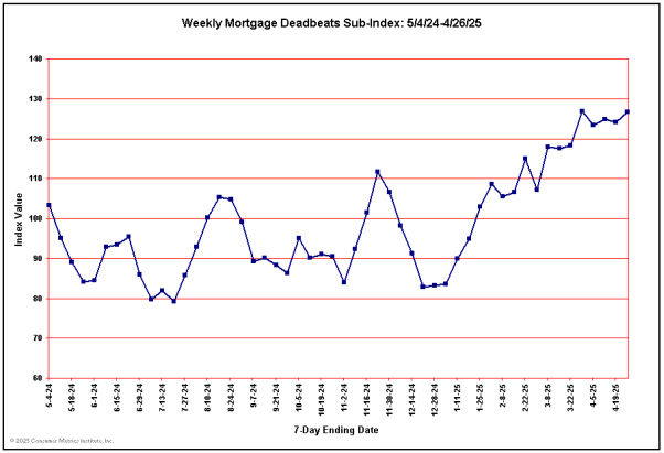 Over the past month we have seen 30% year-over-year contractions in the amount of consumer demand for mortgage delinquency products and services. This contrasts with numbers at the end of last October that were running 20% higher than a year earlier. If this correlates well to actual levels of new delinquencies, we should be seeing similar variations in the level of "free rent" induced spending over the next six months or so. We also publish a chart that we think tells us a lot about the self-perceived financial condition of our on-line consumers -- one that we call the "Personal Finance Sub-Index": 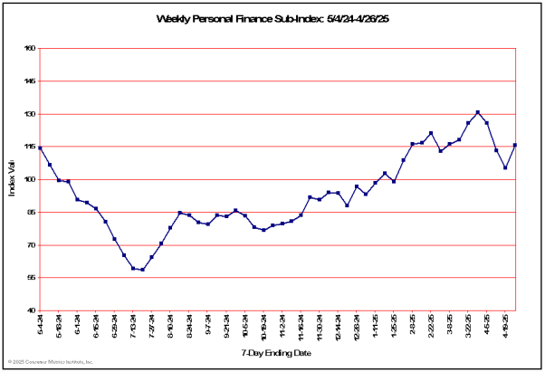 This chart tracks consumer comfort with the state of their personal finances. Among other things it tracks the (inverted) consumer demand for credit counseling services, foreclosure advisors and bankruptcy attorneys. Because we invert the measures of demand for products or services required by financial stress, the line in the above chart goes up as people feel better about their financial situation and down as their circumstances get worse. Despite the reduction in contemplated "strategic defaults," the consumers that we track are not feeling great about their finances at the present time. To some extent our data also indicates that unemployment is not currently the most pressing issue, certainly not compared to late last summer: 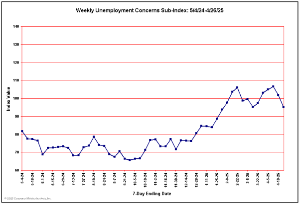 The index shows a 35% year-over-year contraction in those engaging job counseling or employment services. The decline is significant, although we don't have enough information to know whether it simply signals that the worst of the layoffs are over or that job-seeking fatigue has fully set in. Nevertheless, heightened job worries is clearly not the primary source of the broader poor financial self-esteem shown in the previous chart. The most plausible explanation for the cross-currents in the above charts is simply job-search fatigue, coupled with a passage of time that has simply dimmed our consumer's prospects for any imminent relief. We continue to regard a couple of our other sub-sector charts as particularly telling indicators of the comfort that our shoppers have with the prospect of taking on new debt. The first of these is simply new applications for loans for newly acquired residential properties: 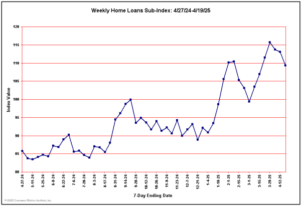 Although this chart has clearly turned upward over the past few weeks, it is still showing a greater-than 30% year-over-year decline. Furthermore, that decline is compounding on what was already a significant contraction 52 weeks earlier (at the left margin of the chart). With the recent upward trend in mortgage rates, we might have expected a far greater rush to lock in the historically low rates. The lack of significant upward movement may simply be signaling that everybody who can qualify for a new home loan already has one. Meanwhile, all of our composite measures for on-line consumer demand remain extremely soft. Looking at our Weighted Composite Index over the past year we see our week-long averages consistently showing year-over-year contraction: 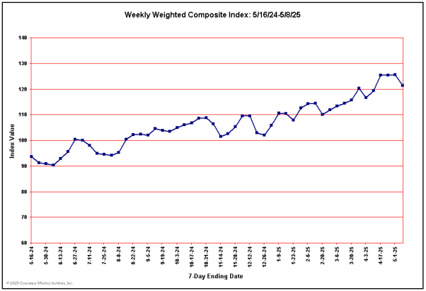 After bottoming during the first week of August, our Weighted Composite Index recovered somewhat, but it now seems to be moving laterally in a zone between a 4% and a 6% year-over-year contraction. A longer look at our Weighted Composite (using 48 monthly averages) confirms the shape of the "Great Recession" as it is generally known, except that our data shows that the subsequent "Great Recovery" faded rather more quickly than either the BEA or NBER has yet reported: 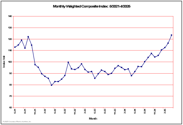 Our favorite way to view the detailed shape of the above chart is contained in what we call our "Contraction Watch," which essentially compares the two dips clearly visible in the above chart by superimposing them, one upon the other. In the "Contraction Watch" chart we actually use our Daily Growth Index (a 91-day trailing average of our Weighted Composite Index) to track the contraction events: 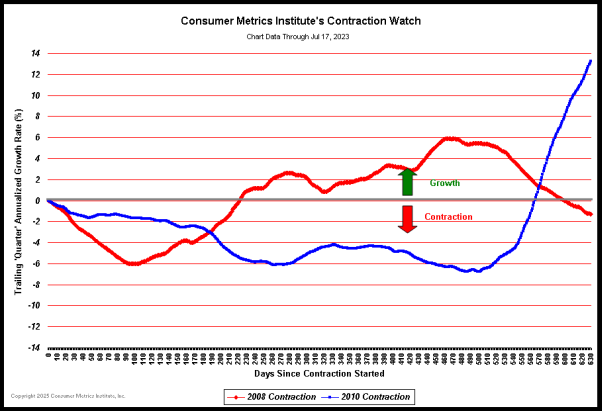 (Click on chart for fuller resolution) In the above chart the day-by-day courses of the 2008 and 2010 contractions in our Daily Growth Index are plotted in a superimposed manner with the plots aligned on the left margin at the first day during each event that our Daily Growth Index went negative. The plots then progress day-by-day to the right, tracing out the changes in the daily rate of contraction in consumer demand for the two events. The 2010 contraction event is now more than a year old, dating back to January 15, 2010. Although the chart clearly bottomed at about 9 months into the contraction (at roughly 270 days), the rise since that bottom has been neither steady nor substantial. In fact, there is no way to forecast when the indicated contraction of on-line consumer demand for discretionary durable goods will end based solely on the recent course of the blue line. Our bottom line remains that any "recovery" currently in progress is probably far more fragile than is commonly assumed. We also believe that our data confirms what most people on "Main Street" already know: that during the "Great Recession" and its postlude, neither the pains nor subsequent gains were fully shared across the broad cross-section of Americans. This recession may have ended for Mr. Bernanke, Mr. Geithner and their colleagues at Goldman Sachs, but it has not yet ended for the on-line "Main Street" consumers that we track on a daily basis. | ||